PC.net began its existence as Sharpened.net. The website was launched with the beautiful home page seen below. Some might say it was one of the greatest artistic accomplishments of the 20th century. Or not.
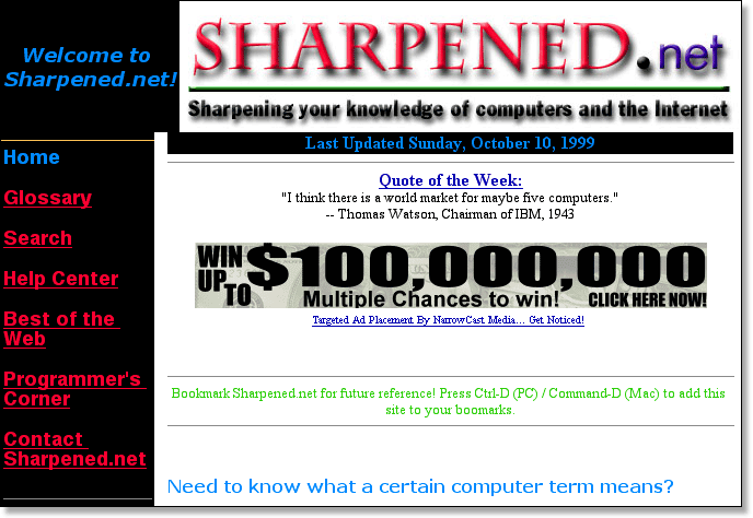
It may shock you to see that this is how Sharpened.net originally looked. It even surprises me. But hey, everyone needs to start somewhere. I had about one year of web development experience when I designed this initial home page.
The misaligned sidebar in the upper-left hand corner is somewhat comical. The disruption is because the "Welcome to Sharpened.net!" text takes up too much space, pushing the table too far to the right. It only happened in Internet Explorer, which rendered the text larger than Netscape did. Of course, I only used Netscape at the time and didn't even notice this for several months. Remember when we all used Netscape? Maybe not. Checking your website on multiple browsers is a pain, but it has to be done.
Also, you may notice the lovely choice of random colors on the page. Websites look better when they have some consistency to them. When it came to color, the original Sharpened.net completely missed the mark. The following examples show what I mean.

The graphic above was the first logo of the website. Notice the "sharp" letters and the excessively dark shadows. If you look at more recent graphics on the site, you'll notice the shadows are less noticeable, but yet still add a nice three-dimensional effect. Here you can clearly see the random use of colors in the logo.
The random choice of color was pretty consistent throughout the website, giving each page a unique visual flair. This is apparent from some of the other page headers I created.
 |
 |
 |
 |
 |
 |
I suppose you could use the word "fun" to describe these images, but they were pretty far from professional. Adobe Photoshop has a lot of great visual effects you can apply to images, but that doesn't mean using all of them is a good idea. I think it takes everybody awhile to figure this out, and I apparently hadn't at this point.