The 2002 version of Sharpened.net boasted an even cleaner and more professional look than the previous design. Granted it was a bit simple, but I preferred to err on the side of simplicity rather than make the pages overly complex. After all, Sharpened.net is a resource site, not a fancy rock band or movie site. When people are looking for information, the faster the pages load, the better.
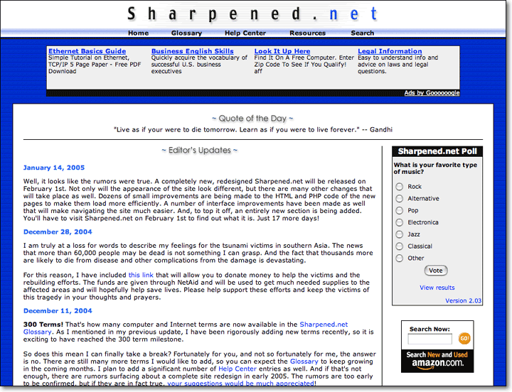
The screenshot below is actually from late 2004 and looks slightly different than the original 2002 design. The border around the table where the main content is was added in 2003 and the black dividing lines as well as the "Quote of the Day" and "Editor's Updates" images were added in 2004. I also updated the blue background with horizontal lines to replace the "box pattern" I originally used, which looked too busy.
Though it certainly wasn't flashy, the site looked decent. I added a bunch of new pages as well, including a glossary of e-mail and chat acronyms, a list of file extensions, and an improved Help Center section. I even added a search area, where you could search the Glossary and other parts of Sharpened.net.
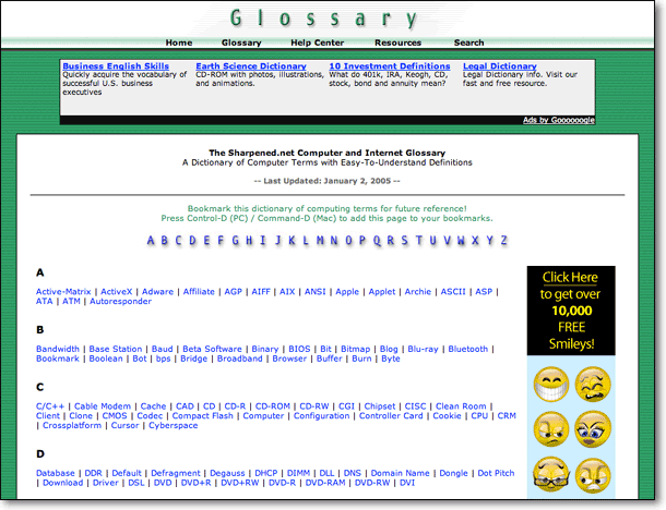
Even though I added a number of new sections when I redesigned the site in 2002, the Glossary continued to be the biggest draw. In fact, the glossary section accounted for over 80% of visits to the website. Below is a scaled-down image of the popular Glossary home page.
Again, it was pretty basic. But as I stated before, page loading speed was a much higher priority than flashy design. Being a graphic designer, it was tempting to create larger, fancier images and splash them over all the pages. But I managed to keep both the images and pages simple. This strategy worked pretty well. By the end of 2004, Sharpened.net was receiving over 600 unique visitors a day.
The biggest functional change to the website was the addition of DHTML/JavaScript drop-down menus. The menus allowed me to list several links in one place, without cluttering up the page. Instead of regular links, the Home, Glossary, Help Center, Resources, and Search links at the top of the page were now menus with subcategories. Below is an example of what happened when you rolled over the "Glossary" link.
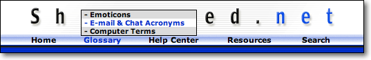
Fascinating, isn't it? Well, for 2002 it was pretty impressive. Since then, most major informational websites have added drop-down navigation menus in one form or another, so the novelty as pretty much worn off. In 2004, I changed the menus to pop up instead of pull down - just to be different. OK, the real reason was because the menus interfered with the ad banners below the header. But it was still nice to have something different than the plethora of other informational sites out there.
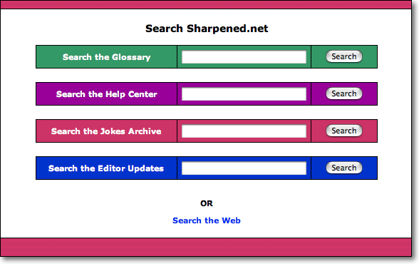
I also added a search page that allowed users to search the Glossary, Help Center, Jokes Archive, and Editor's Updates. I wrote the search engine from scratch, using a number of MySQL queries within the PHP code. While the search engine worked, it was so basic that I felt it was hardly useful. Sure, it would find words from the right tables in the database and return the results. But sorting the results, omitting certain words, and displaying the results in a useful format proved to be far more challenging than I had hoped. I began to understand why programmers are paid tens of thousands of dollars to develop high-quality search engines. So in the 2005 redesign, I decided to hold off on the search page until I could dedicate more time and resources to it.