It took long hours of hard labor, but in the end, I came up with a design that was simpler, more efficient, faster-loading, and most-importantly, better-looking.
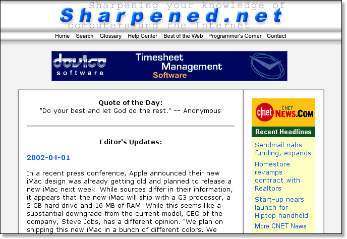
The new design was much cleaner than the previous version. In late 2000 and early 2001, there was a trend towards simplicity in webite design. Too many sites were far too elaborate and image-heavy and took forever to load. Visiting a site and waiting 30 seconds for fancy images to load was just plain frustrating. I had experienced this frustration first-hand and was determined to make Sharpened.net clutter-free. That was the basis of my new design.
Another major part of the new design involved moving the links from the side of each page to the top. This eliminated the need for a sidebar, giving me more space to work with. Sidebars are useful in some situations, but they take up the entire side of the page, regardless of how much of it you need. Therefore, all the blank space in the sidebar is wasted. By moving the links up to the top of the page, I used up less space for the navigation and had more room for useful content.
Another major aspect of the new design was the three-dimensional look of the header on each page. I often joke that Apple Computer stole the design from me, but I like Apple so I didn't complain. They did a much better job with it anyway. I added the 3D look at the last minute because I wasn't content with my first new design. Actually, it wasn't really the last minute, because after I made the decision it took me a few days to finish.
Below was the new "logo" for the Web site.

Pretty exciting, huh? Not really, I know. But it was simple and clean, and that's what I was going for. The rest of the images were no more exciting than the home page header. Each one was made on the same 468x60 template, which was mainly white, but had shading on the top and bottom.
Then I had to make images for all the links below the header, using the same strategy. This was a bit harder, since each image was a different length. I also had to make two of each image for the rollovers, so when visitors moved the cursor over one of the links it turned an exciting red color. Web development had gotten to the point where people expected to see rollovers, so I didn't want to let anybody down. It took me a little while to learn and write the JavaScript for them, but it was worth it. This is how it turned out. Can you find the active rollover link below? (Hint: It's the red one.)
![]()
So, the images had a nice 3D look to them. But I also wanted to make the 3D header expand the width of the page. This was great fun because some methods I tried worked in Internet Explorer, but not in Netscape, while others worked in Netscape, but alas, not in Internet Explorer. I finally found a solution that worked in both. I first made a table with three columns -- one for the left side, one for the header image, and one for the right side. Then I made an image a couple pixels wide that was white and had the same shading as the header. I placed the image in the left and right cells, set them each to expand to 100%, and voila!, it worked in both Netscape and Internet Explorer. I did this for both the header and the navigation bar below it, so that the 3D look at the top of each page extended fully to the sides. This design was so good that it lasted for over a year and a half.
But after awhile even this design began to look dated and I felt it could once again use a full makeover. So I created a new blank Web page and started from scratch. Little did I know, I would end up adding several new features to the site as well.