Having made its mark on the Web and society, Sharpened.net had established its presence on the Internet by the year 2000. People were telling their friends about the site and the number of daily visits to the site climbed. There were days where over fifty people visited the site within a 24 hour period!
OK, so nobody really knew about Sharpened.net, and frankly nobody cared. What could be done to change this sad situation? Was the website simply not attractive enough? Certainly not. Nevertheless, I decided to take a hard look at the site and make a list of any improvements that could be made. Sure enough, I found more things that needed work than things that didn't.
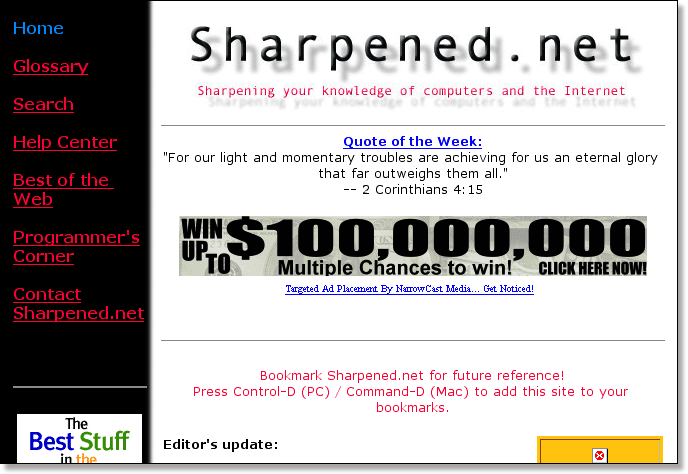
The screenshot below is from early 2000.
So the site looked slightly better. I kept the same overall design, but added a pretty shadow to the sidebar on the left side of the page. This was hot stuff in 2000. I also redesigned the logo with a much cleaner, simpler design. So simple, in fact, I could recreate the logo from scratch in under two minutes. To get rid of the misaligned table problem, I got rid of the "Welcome to Sharpened.net!" message above the links on the left and made the the links on the sidebar fit correctly in both Netscape and Internet Explorer. My color choice also became more consistent as I tried to stick with simple reds and blues. I was starting to become an experienced Web developer.
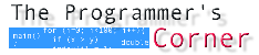
I figured if I was aiming for color consistency, the old images had to go. Yes, I know they were fun, but the complete lack of professionalism was a problem. So, I created new ones. Below are the new page headers I made.
 |
 |
 |
 |
 |
 |
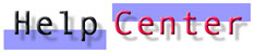
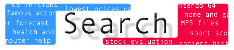
It is pretty easy to notice the consistent color pattern -- red, blue, black, and white. Or wait, is that light blue in one image and dark blue in another? Or is it purple? So much for consistent colors. I suppose I didn't do a horrible job for completely guessing at the colors when I made the various images, but they are clearly not the same. Considering the site still was attracting less than 100 visitors a day, I decided it wasn't a big deal and left the new images for a few months.
>t some point during the summer of 2000, I finally decided to update the images. This time I was smart enough to store the blue and red shades I wanted to use in the Swatches palette in Photoshop. I also added a little pizazz to them by scattering words pertaining to the topic within the image. For once, the images actually took me awhile to make.
 |
 |
 |
 |
 |
 |
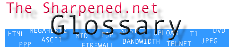
Here's a better view of the Glossary header:
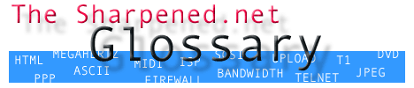
Pretty fancy, huh?
Besides updating the images, I left rest of the site pretty much the same. I didn't even update the Sharpened.net logo (since it would have taken at least two minutes to create a better one). I kept the sidebar on the left with all the links and just made some slight changes to the colors to match the ones of the new images. Finally, the site was starting to look somewhat professional.
I put a lot or work into the recent updates, so I decided to take a break. However, my hiatus did not last long. In the following months, for reasons beyond my scope of knowledge, the visitors started pouring in. Near the end of the year, I was getting over 200 unique visitors a day. I felt enormous pressure to improve the site. However, I knew that with the growing number of competing Web sites out there, a simple revamp of the images wouldn't cut it this time. I needed to do something drastic, something crazy, something that would take up way too much of my time. I decided to completely redesign the site from scratch.