Snapchat's Valuation Reaches $1 Trillion
April 1, 2016 — by Per Christensson
 As the economy stabilized during the first quarter of 2016, the values of tech startups have risen to new heights. None is more prominent than Snapchat, which has only been around since 2011. The company was valued at $3 billion in 2014 and $16 billion in 2015. In the first three months of 2016, the company's valuation has skyrocketed to $1 trillion.
Snapchat is now worth more than all the FANG stocks (Facebook, Amazon, Netflix, and Google) — combined.
While accelerating user growth would appear to be the reason for Snapchat's lofty value, analysts credit the valuation to the app's incredibly intuitive user interface. "Of all the apps available on the market, Snapchat has the best interface," said Jeff Jeffries from First US Capital, one of the firms confirming Snapchat's thirteen digit valuation. "There simply isn't a more intuitive app available."
Perhaps it the way Snapchat predicted how people would naturally associate light blue boxes with text, red boxes with photos, and purple boxes with videos. Or maybe it is the way the app allows users to continually swipe left or right and eventually end up on the screen they want. It could also be the fact that the only way to access the app's main options is to tap the ghost icon on the top of the camera screen, then click the settings icon in the upper-right corner.

Snapchat's camera screen is the hallmark of what a user interface should be. Besides the ghost icon at the top of the screen, it includes a box outline in the lower left and the standard three-line menu icon in the lower-right. The outline of a box obviously directs users to their inbox, while the menu icon doesn't open a menu, but opens the "Stories" page. What's even better is that these buttons perform the exact same thing as swiping left or right. If you want to access the "Discover" page, simply swipe right when you're viewing the list of Stories. Just don't swipe in the Discover or Live sections right in the middle of the Stories page, or it won't work.
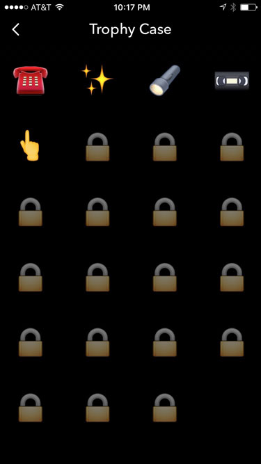
The Snapchat developers may have hit the jackpot in user experience by including several features that nobody understands. For example, the trophy case displays a few trophies achieved by performing the standard Snapchat functions, but lock icons appear for undiscovered trophies with no clues on how to get them. People also love the way Snapchat displays "[username] is typing…" on their device's home screen before a person sends a snap, which appears even if the person doesn't send the message.

Before sending a snap, users can apply a photo filter, which adds an effect to the image. These filters are so amazingly basic, they may well have been created by a freshman computer science student by accident. Additionally, the text overlays are conveniently limited to a single line of text, forcing users to use the draw feature to finish sentences. The alternative text options are just as basic, offering only one font, no effects, and no extra characters.
All these amazing features are secondary to one aspect of the program that singlehandedly represents the quality of the Snapchat app — the icon. The white ghost shape with a black outline on a plain yellow background may be some of the finest artistry the wold has ever seen. The Snapchat icon, which is rumored to have taken a dozen graphic designers three months to create, showcases the attention to detail embraced by the Snapchat development team.
It is rumored that the icon for the next version of Snapchat might include a slight gradient. The updated icon could push Snapchat's value upwards of $2 trillion. Happy April Fool's.
 Home
Home March 14th