That Notch Tho
September 13, 2017 — by Per Christensson
Apple introduced the new iPhone 8 yesterday. Then they introduced the even newer iPhone X.
Why no iPhone 9? Because 7 ate 9, of course. Maybe the number 9 is bad luck in the tech world. Microsoft jumped from Windows 8 to Windows 10 and now Apple is skipping the nine in the their iPhone line. I suppose Apple could still introduce an new older model (does that make sense?) called the iPhone 9 next year, but let's not worry about that for now.
The only thing I'm worried about right now is that "notch" at the top of the iPhone X screen.

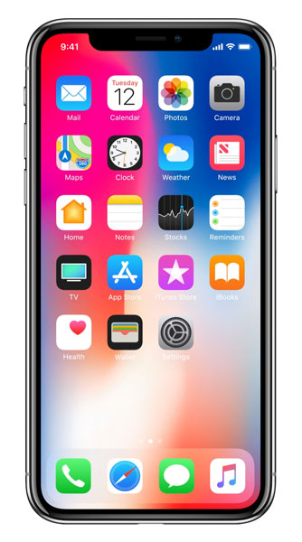
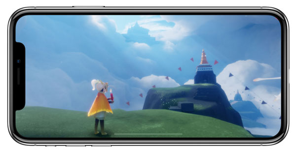
It looks OK on the home screen when the corners are used for the time and status information. But in other cases, such as viewing photos and videos, it literally covers up part of the image.

I'm sorry, but that is not a "full-screen display." When Apple demoed a game on the iPhone X, the notch was actually covering up part of the touchscreen controls. [Facepalm]
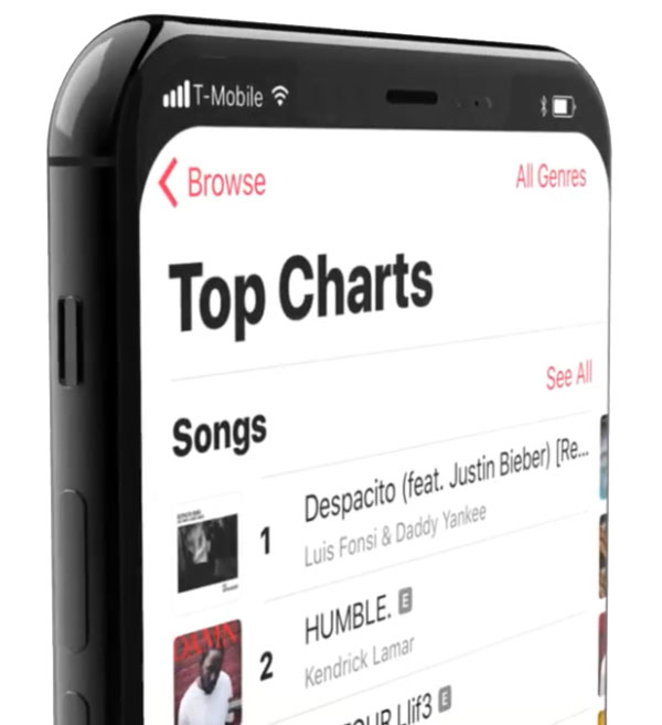
I don't understand why Apple didn't just leave all the status information in a single separate bar, inline with the camera, speaker, microphone, sensors, and everything else housed in the notch. I saw this design idea on the web, which is close to what I imagined.

The screen is also significantly curved at the corners. This could be problematic for several apps, games, and videos, that display information near the corner of the screen. It seems Apple was so determined to make a full-screen display, they made some significant compromises.
Maybe I'm making this too big of a deal, but right now that notch is preventing me from ordering iPhone X. Even with all the new fancy features included with the X, I might end up buying the iPhone 8 instead.
 Home
Home June 29th