Through 2002, I had updated the design of Sharpened.net once a year. That may sound crazy, but lots of websites were doing annual revisions back then. In the late 1990s early 2000s, the Web was still rather new and Web standards were in a constant state of flux. This meant new capabilities were constantly being introduced and often required a wholesale redesign of a website to implement.
Fortunately, around 2002, the look and feel of websites started to become more consistent and so did the Web standards, such as HTML and CSS. This meant Web developers, such as myself, had little reason to redesign sites more than once every few years. The 2002 design lasted for three years and I focused more on adding quality content than constantly sprucing up the website interface. However, by the time 2005 rolled around, I had learned several new Web design techniques and decided it was time for another renovation.
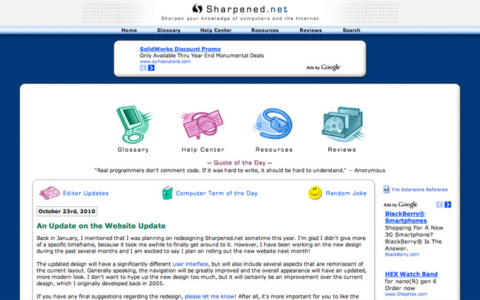
Below is the home page of the 2005 website.

The 2005 redesign of Sharpened.net kept the same basic layout as the 2002 version, but included a softer 3D look for the main content area. Each page also included a redesigned header, which provided more information about the webpage. The navigation bar remained relatively the same, but also received a 3D update. I kept the pop-up menu, which I created using the fabulous MenuMachine plug-in for Adobe GoLive.

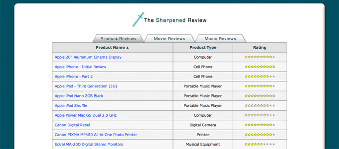
The introduction of the 2005 website also included new content. Some examples include the Editor Updates archive, a Computer Term of the Day, and a Random Joke, as seen above. I also added a new section called the Sharpened Review (notice the "Reviews" link in the navigation bar), which included product, movie, and music reviews. While I enjoyed writing reviews, the process was very time-consuming and the new reviews slowly became less and less frequent. I would eventually decide to remove the Sharpened Review section from the website.

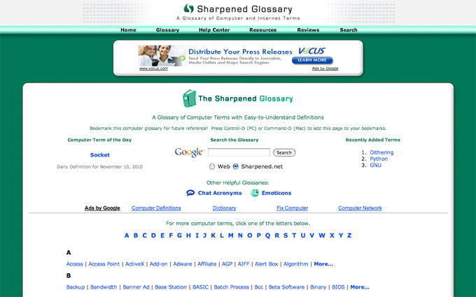
The Glossay section, which included computer terms, chat acronyms, and emoticons, continued to be a popular section of the website. Eventually, the Acronyms and Emoticons sections would receive even more traffic than the definitions of computer terms.

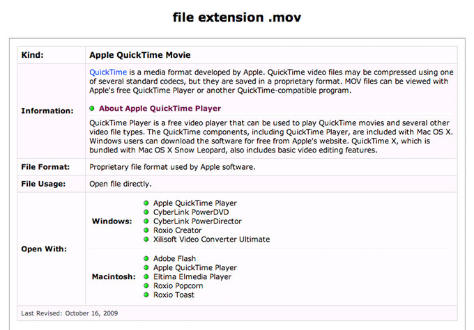
Another big hit was the File Extensions section. For awhile, this was the most popular section on the website. Shortly before publishing the 2005 redesign, I had converted all the file extension entries from static pages to a database of file extensions. This allowed me to add new extensions much more quickly and helped the File Extensions section grow in size. Below is an example of one of the file extension entries.

Thanks to the increased traffic to the File Extensions section, as well as growth of the Acronyms and Emoticons sections, Sharpened.net continued to grow in popularity. Between 2005 and 2010, I focused primarily on adding new content. In fact, by 2010, the amount of information available on Sharpened.net was roughly four times greater than it had been at the beginning of 2005.
While the average frequency of website redesigns had declined significantly by 2010, after five years without a major design update, Sharpened.net was beginning to look a bit dated. It was time for another overhaul.