Mini Review: iOS 7
September 24, 2013 — by Per Christensson
 If Android and Windows 8 had a baby, it would be named iOS 7.
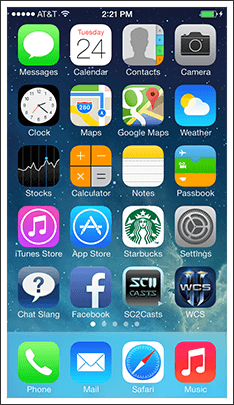
Apple's latest iOS is strikingly similar to Android and the few differences seem like they came straight from Windows 8. Most of the new icons are colorful and flat (not three-dimensional), like most Android icons. Several icons are composed of a white silhouette set against a solid color background, just like most Windows 8 (and Windows Phone) icons. The skinny text is similar to Android's default font as well.
It's surprising to see Apple following the current design trends rather than setting them. It appears to be more evidence that Apple is playing catch up in the mobile space, rather than leading the way. I could ramble on about Apple's leadership and the direction of the company, but the more important question is how iOS 7 compares to its predecessor iOS 6. Is the user interface better or worse?
IMHO, the iOS 7 interface is actually worse. I've only used iOS 7 for a few days, but my first impressions are not great. The flat, simplistic icons seem like a major step back in aesthetics. The icons have gone from beautiful 3D representations to basic shapes that seem to have taken minimal effort to create. They look like sketches that haven't been finished yet – but they are the final versions. I don't need super-realistic icons on my iPhone, but icons with some at least depth would be nice.
Apple's built-in apps have also been updated with the ultra flat design and include significantly more white than before. The whitewashed appearance may look cleaner, but there is so much whitespace on each screen that I've been having difficulty locating certain features and commands. The new Calendar and Mail interfaces were supposedly improved, but I find them harder to use than before. The wireframe icons included in several of the new apps are so basic, it's hard to tell what they do until you tap them.
While there are several things I don't like about iOS 7, I think the new font is nice and the clean appearance of some of the apps is an improvement. Overall, however, I think iOS 6 looked better. More importantly, it was easier to use. Maybe I'm just having a hard time with such a major change, since I've owned an iPhone from the day the first one was released. If you have any comments about the Apple's new mobile OS, I'd be happy to hear what you think.
 Home
Home March 25th