 Home
HomeLimit Your Fonts and Colors
May 2017 — Tip of the Month
Designing a webpage, brochure, or other page layout? Be creative — but don't overdo it.
People appreciate unique designs, but they also appreciate simplicity. Just because you can use 100 different fonts and 1,000 different colors, doesn't mean you should.
Too many fonts – or even font sizes – can be distracting and make your content difficult to read. It's typically best to choose one typeface (Open Sans, for example) and only use three, maybe four, different font sizes on a single page.
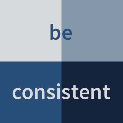
Too may colors inevitably leads to clashing hues. Instead, try to limit the primary colors on a page to three or four. This may seem stifling, but there are thousands of color palettes out there that you can use as a starting point. Deciding on a three or four color palette may actually spur some newfound creativity, allowing you to focus on other aspects of the design.
Limiting the fonts and colors on a page has the added benefit of pruning the less attractive options. You're left with the best-looking fonts and colors, which will give your final product a more professional appearance.
 April 2017