Review: 2022 Apple MacBook Air with M2 Chip
September 24, 2022 — by Per Christensson
 The 2012 15" MacBook Pro is the best Mac I've ever owned. It's a surprising statement since I don't even like laptops. I prefer my standard desktop computer setup with three 27" monitors, a mechanical keyboard, and two mice. But the 2012 Retina MacBook Pro was so perfectly designed that I grew to love it. After ten years, the screen went dark, and the legendary laptop was laid to rest.
It was finally time to upgrade, and fortunately, Apple had just released the new M2 MacBook Air. I ordered mine with the following specs:
- Midnight blue
- M2 1-core CPU, 10-core GPU, 16-core Neural Engine
- 16 GB unified memory
- 1 TB storage
I've been using the new "MBA" for about two months, which has given me ample time to put it through its paces. How does it measure up to the legendary 15" MBP? Read on to find out.
The Screen
It was an unlikely decision to "downgrade" my screen size, but after traveling so much over the past ten years, I thought a smaller, lighter laptop might make more sense. After a few weeks of using it, including an overseas trip to Sweden and Denmark, I'm happy to say it was the right choice. The 13.3" screen size works great for daily tasks, and I don't miss the extra two inches. I also appreciate the improved quality of the display. While the 15" retina display was ground-breaking ten years ago, the MBA's liquid retina display is a noticeable improvement, with deeper blacks and more vibrant colors are across the spectrum.
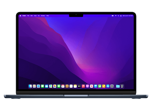
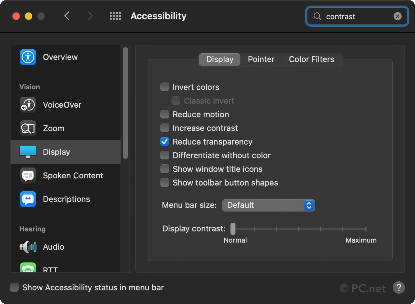
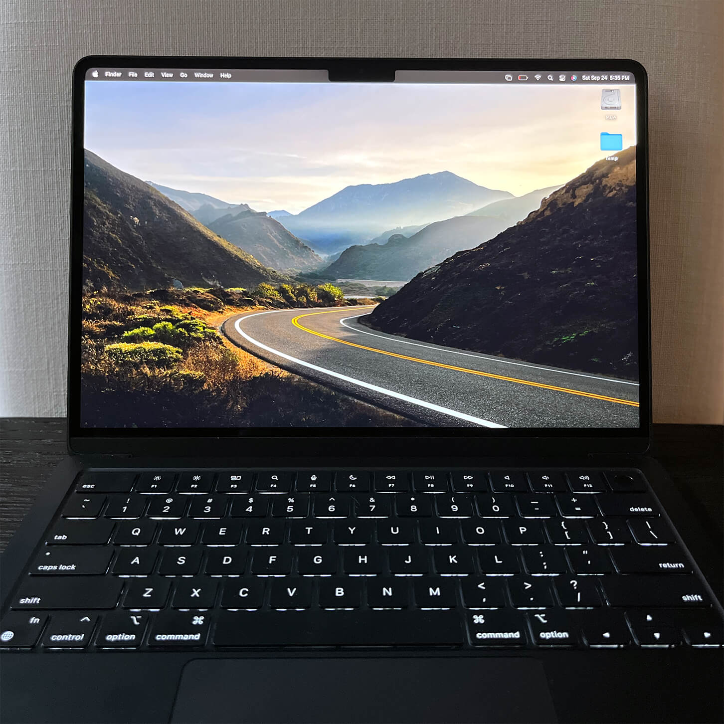
What I don't like is — you guessed it — the notch. The black notch in the top-middle section of the screen is so noticeable in light mode, it almost forces you to use dark mode. Fortunately, I use dark mode regardless. But the notch is even prominent in dark mode! Apple has done away with the black menu bar in recent versions of macOS, so the only ways to "hide" the notch are to use a custom desktop background that's black at the top or turn on "Reduce transparency" in the Accessibility pane within System Preferences. These are both hacks and make me wonder if Apple doesn't want users to hide the notch.

By not letting users hide the notch, it's easier to tell someone is using a Mac when looking at the screen. Sounds like a conspiracy, except when you realize there was no reason to add the notch to the MacBook Air. Apple could have fit a camera even larger than the iPhone's selfie cam in the top section of the bezel without adding a notch. Even if Apple had made the bezel a few millimeters taller, it would not affect the overall design. What is noticeable is the hideous notch that is *always* visible.
▶ I know people have different opinions on Apple's notch philosophy. Some users say they get used to the notch and don't notice it. I'm not one of those people. To be fair, I also like my iPhone 13 mini, which apparently wasn't popular enough for Apple to reprise the design with the iPhone 14. FWIW, I don't like the notch on the iPhone 13 either.
Size and Weight
Besides the notch, the 2022 MacBook Air is designed exceptionally well. It is surprisingly thin and has just the right about of curvature around the edges. Thankfully, it doesn't have those side vents that almost cut your hands on the MBP 14" and 16" models. The screen opens with just the right amount of pressure — something Apple has always done well. I miss the old MBA's tapered design, but it's not as easy to cram components in a slanted chassis, so I don't mind Apple weighing function over form for a change.

As thin as the new MBA is, it isn't quite as light as I expected. It's hard to fault Apple for the weight since the density shows how much they crammed in the case. While I was hoping for it to be slightly lighter, the 2.7 lbs is a welcome 50% reduction from the 5.6 lbs weight of my old 15" MBP.
Several early reviews said the 2022 MBA shows fingerprints more than previous Apple laptops. It's true — but it's also not a big deal IMO. I love the dark blue "Midnight" color and highly recommend it.
Performance
The performance of the M2 MacBook Air is incredible. Over the first few months, it has easily handled everything I've thrown at it. Startup and app load speeds are noticeably faster than my old MacBook Pro, and window scrolling is silky smooth. The M2 processor flies with Apple Silicon-optimized apps and runs Intel-based programs without noticeable slowdown. I've only come across one app that doesn't run on the M2, which strangely runs fine on an M1. More on this later if I can figure out why.
I'm running the high-end MacBook Air with the 10-core GPU and 16 GB of RAM, but I can't imagine the base model is much slower. I haven't pushed this machine near its processing limits or memory usage, and I haven't heard any fans — because there are none. I run most of my memory-intensive editing apps and VMs on my iMac Pro, so this small and snappy laptop is a suitable secondary Mac.
Pros
- Sleek design
- Bright, colorful, high-res display
- Extremely fast startup and app load speeds
- Incredible performance for a small laptop
- MagSafe power connector
- Touch ID
Cons
- Huge, unnecessary notch in the top of the screen
- Only two Thunderbolt 3 / USB 4 ports, both on one side
- Questionable keyboard with inconsistent feel
Conclusion
Apple's 2022 M2 MacBook Air is a beautiful computer with an unfortunate notch in the display. Besides that tragic flaw, it's an excellent laptop that is ultra-portable and has more power than 90% of users need. I don't expect to get ten years out of it like my last Apple laptop, but I'll aim for at least five. If I can get used to the notch.
 Home
Home November 25th